
Hello! I’m Dan, a Creative Lead in London with over 13 years experience and a passion for compelling imagery, story telling, and bold ideas that become a part of culture. My experience spans Creative Concepting, Copywriting, Art Direction, and Graphic Design of Advertising Campaigns with a focus on Digital Activations, Social Content, and Integrated Brand Experience for Global brands.
Experience:
Agency: Wieden & Kennedy, Dept, Ogilvy, VMLY&R, Havas, Impero, Hogarth Worldwide
Inhouse: Estee Lauder Companies, KraftHeinz, Unilever, Itsu, Wilhelmina Models, Alexander McQueen.
🏆 Awards:
-D&AD Wooden Pencil 2020
-Grocer Top Talent 2019
-Leonardo Da Vinci Grant 2013
Copywriting︎︎︎
Art Direction︎︎︎
Graphic Design︎︎︎
Illustration︎︎︎

For modeling agency giant Wilhelmina’s second-ever Fashion Week, we wanted to make a strong statement. Known in the U.S. for its extensive commercial roster of talent, Wilhelmina London—having just acquired an East London–based independent agency—wanted to introduce a sharper, more editorial edge. I developed a sleek, linear logotype to serve as a seasonal brandmark for the agency.

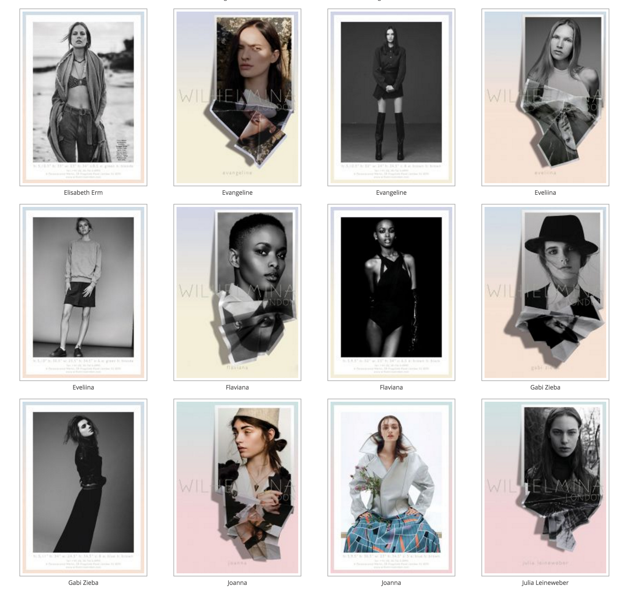
I started the creative process by creating a moodboard, using the concept of contrast as my starting point. I was fascinated by imagery of distortion and reflections, paired with delicate, graded colour palettes. I liked the idea of the models peeling away from the cards, as if they were stepping halfway between a photograph and the real world.
From there, I began physically experimenting with printed photos of the models’ best shots, mostly in sepia or greyscale, and then compositing them onto gradient backdrops. The interplay of harsh lines and soft pastel colours resulted in an aesthetic that felt both soft and bold at the same time.
