
Hello! I’m Dan, a Creative Lead in London with over 13 years experience and a passion for compelling imagery, story telling, and bold ideas that become a part of culture. My experience spans Creative Concepting, Copywriting, Art Direction, and Graphic Design of Advertising Campaigns with a focus on Digital Activations, Social Content, and Integrated Brand Experience for Global brands.
Experience:
Agency: Wieden & Kennedy, Dept, Ogilvy, VMLY&R, Havas, Impero, Hogarth Worldwide
Inhouse: Estee Lauder Companies, KraftHeinz, Unilever, Itsu, Wilhelmina Models, Alexander McQueen.
🏆 Awards:
-D&AD Wooden Pencil 2020
-Grocer Top Talent 2019
-Leonardo Da Vinci Grant 2013
Copywriting︎︎︎
Art Direction︎︎︎
Graphic Design︎︎︎
Illustration︎︎︎
The Packaging: Itsu set out to shake up the instant noodle category with a healthier alternative to Pot Noodle, introducing rice noodles paired with hand-crafted miso broths. To match the ambition of the product, they needed packaging that could stand out against bold competitor designs while still reflecting itsu’s values of health, lightness, and authentic Japanese influence. As designer and art director, I was responsible for creating this new visual identity.
I drew inspiration from Japanese brush paintings, calligraphy, and iconography, reimagining them into a modular system of bold strokes and colours that distinguished each SKU. This direction was refined into a premium execution: matte white card embossed with a delicate grid pattern, where subtle Japanese details met a modern, elevated aesthetic — helping the range stand out as both innovative and high quality.
 Early concept sketches
Final Design
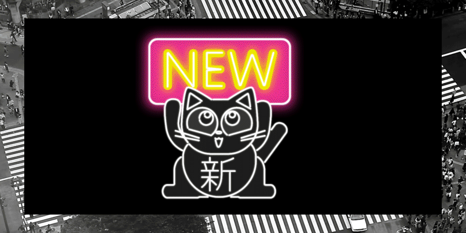
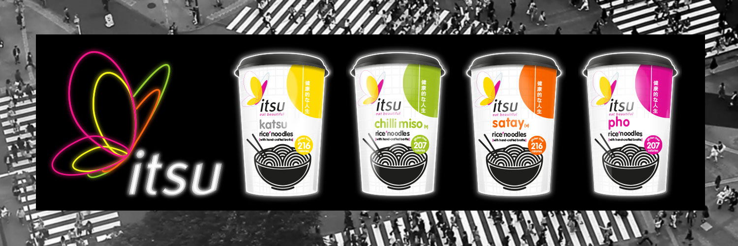
The Launch Campaign: For itsu’s major noodle range refresh, the launch needed to connect with the modern, on-the-go consumer through bold visuals and messaging. The pack design—featuring authentic Japanese rice noodles and miso from the Hikari Valley—used block colours and Japanese-inspired iconography, which naturally lent itself to a neon city light reinterpretation. To distinguish the range from typical instant noodles, the campaign centred on the message: “Eat with Pride.”
A custom extended-condensed font, inspired by urban neon signage, was paired with a fortune cat character carrying the Japanese characters for “NEW.” The itsu logo was reimagined as a simplified neon sign in the noodle range’s colour palette, and these elements were animated as flashing lights over looping footage of Tokyo’s Shibuya Crossing to emphasise speed and accessibility. The campaign launched across major UK tube and train stations and received a strong public response.
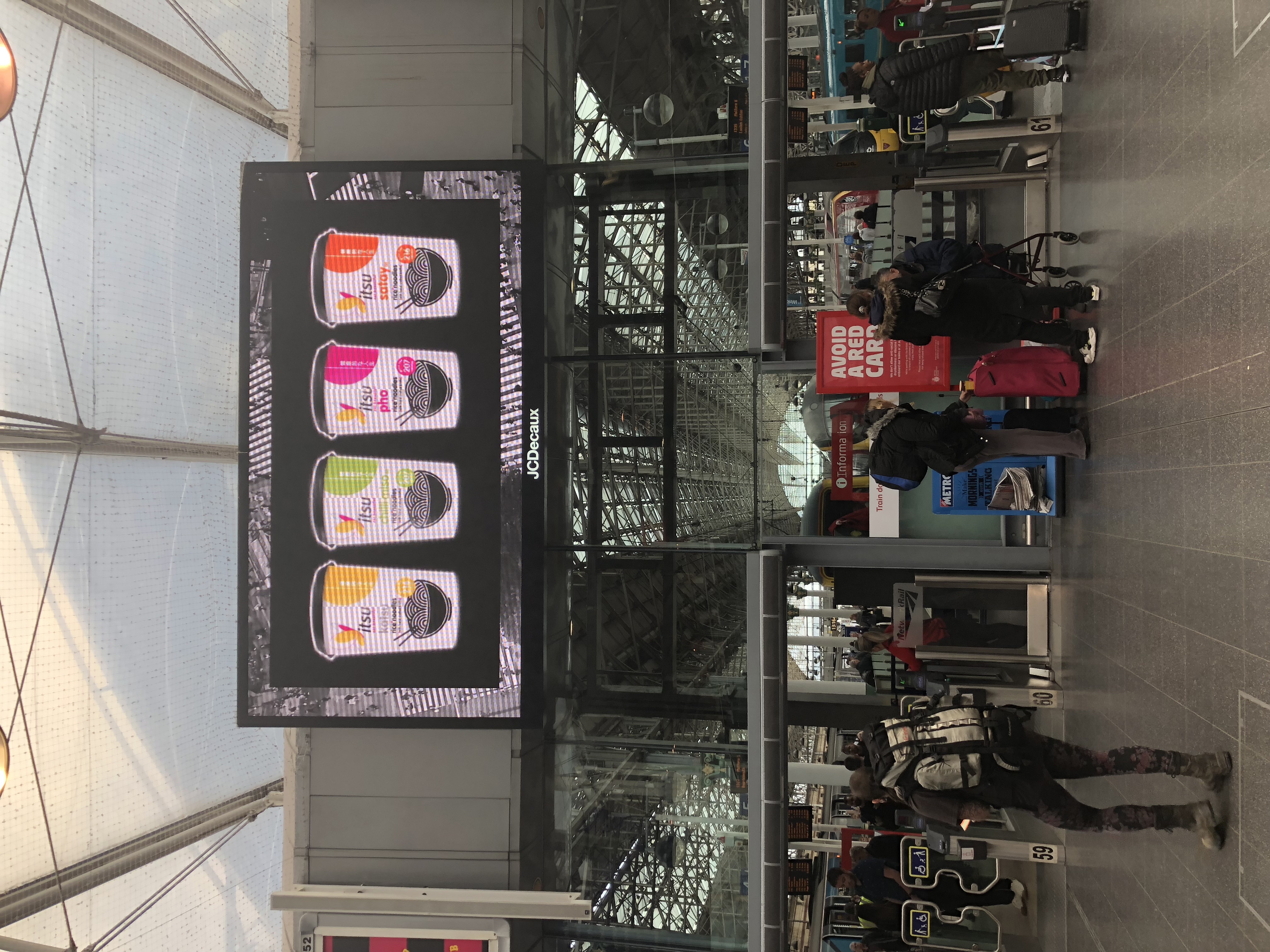
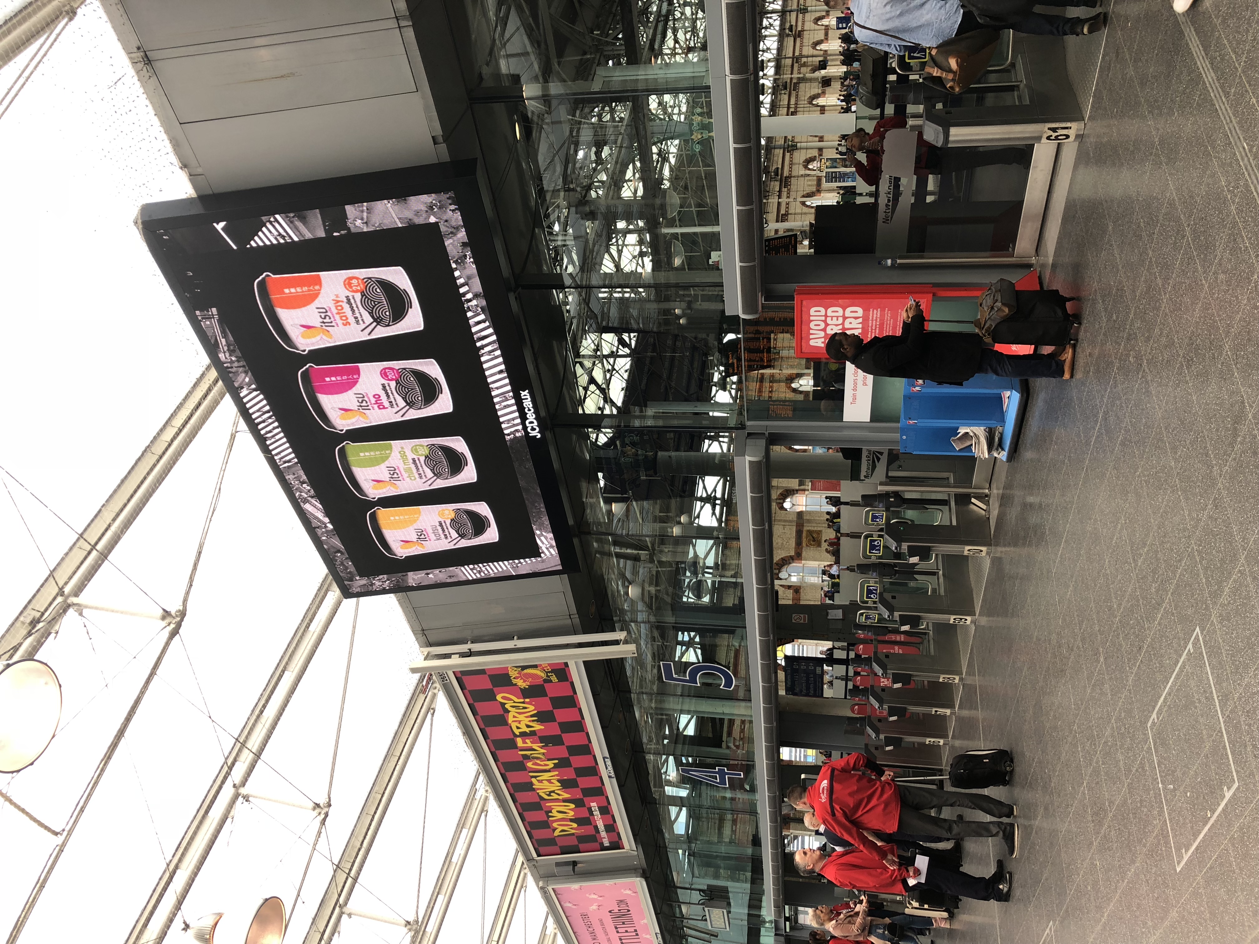
Manchester Picadilly